Design documents in 64x64; Am I going too far ? - Lueur devlog #2
Hey everyone !
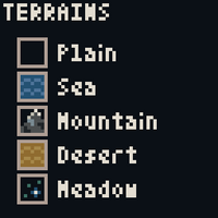
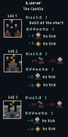
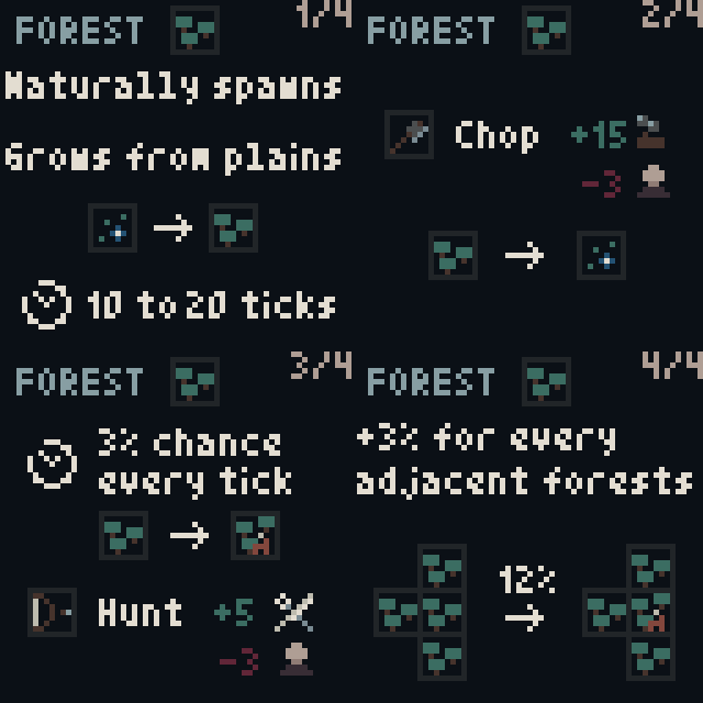
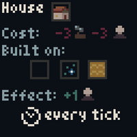
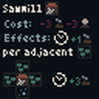
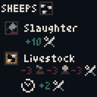
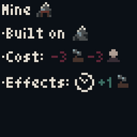
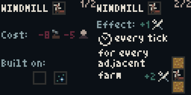
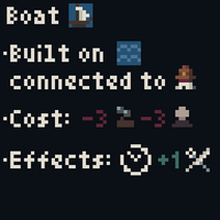
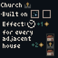
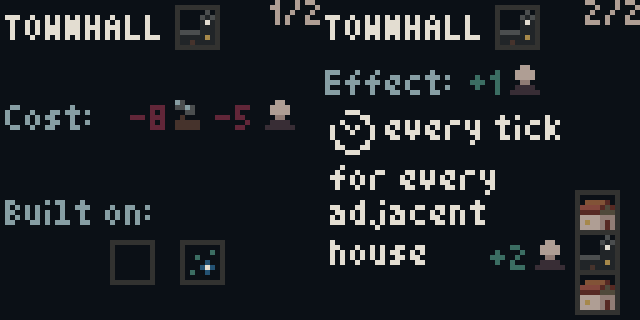
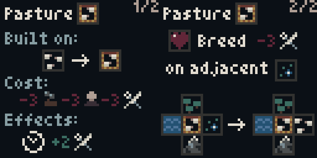
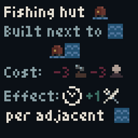
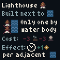
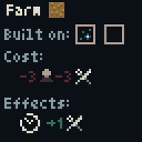
Three days ago I worked on "Grid Game Mechanics" and established a first list of buildings and entities for the game. I decided to dive in the design of these; how they are built, what are their effects and how they interact with each other (using grid mechanics). I got the idea to directly write down those design on 64x64 pixel art documents, "design cards". You can see them in the gallery at the top of the post.
But... Why ?
I know, it sounds crazy, but bear with me; Here's the few positive things about it :
- It kept me from going too far. With a bigger canvas, I would have designed more complex things.
- I learnt to use the 64x64 canvas as a display, which is gonna be useful for the game.
- I've made the game sprites in the process.
- Those are actually 64x64 tutorials that I can use directly in the game !
- I can post them on twitter and get feedback. Each "design card" is so small it's easy to show in a tweet or post.
- It was very fun to do.
I now have a clear vision of the game. The next step is to program the basic mechanics and implement the design cards one by one. Of course I'll need to playtest the game and change the design as I go along.
Final words
Feel free to let me know your thoughts in the comments. How much time did you pass on the design before starting programming ? Did you write design documents ? Maybe you prefer starting from an idea and then iterate, how did it work out so far ? Could you have avoided errors by taking more time designing before ?
Also don't forget to follow me to be notified each time I post a devlog !
See you !
Get Lueur (LOWREZJAM version)
Lueur (LOWREZJAM version)
A minimalist city builder with bits of survival into a fantasy medieval world. And it fits into a 64x64 square !
| Status | In development |
| Author | Darenn Keller |
| Genre | Strategy, Survival |
| Tags | City Builder, Dark Fantasy, Fantasy, Godot, LOWREZJAM, Medieval, Minimalist, Pixel Art, Relaxing |
| Languages | English |
| Accessibility | Color-blind friendly, Textless |
More posts
- Want to play a chill building game?Apr 19, 2023
- Playtesting on the Switch is awesome! | Lueur Weeklog #8Feb 13, 2023
- Playable version and interesting design changes inspired by 64x64 constraint - L...Aug 09, 2022
- Finally get to programming, core gameplay is there ! - Lueur Devlog #3Aug 08, 2022
- Brainstorming game mechanics and relearning Godot - Lueur devlog #1Aug 02, 2022
- Preparing the jam; Intentions, Tools Setup and Benchmarking [Devlog #0]Jul 31, 2022
- How to setup Godot for LOWREZJAMJul 30, 2022
Leave a comment
Log in with itch.io to leave a comment.